

Logo & Visual Identity Design Built to Ship
From primary mark to full asset library, we design, refine, and ship the logo, type, color, and iconography your team uses every day.
From Sketch to Shipped File
The Old Way
Off-the-Shelf Logos
The Intelegencia Way
Production Identity
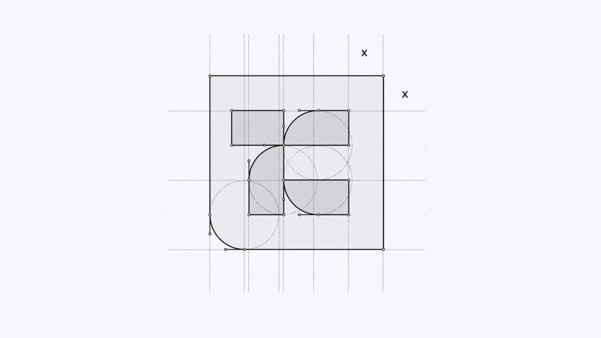
Logo Mark Construction
Every primary mark we ship is built on a precise geometric grid so it renders crisply at any size and reproduces faithfully in every medium: print, embroidery, screen, and favicon. We draw curves with optical correction, balance positive and negative space, and test legibility at the smallest real-world use case (typically a 16px favicon or 24px app icon) before sign-off.

Category Signal Audit
Before we sketch a single mark, we map the visual language of your category: which colors, shapes, and mark styles competitors use, and which signals actually read as trust, precision, or value to your audience. Design directions are then grounded in that evidence, so the mark you choose is strategically distinct in your market, not just pleasing in a presentation deck.
Identity Asset Library
Production-ready mark families, type systems, color palettes, and icon sets, all documented and tested to ship fast across every channel.
Logo Set
Primary, secondary, monochrome, reversed, and lockup variants.
Typography
Display + body type pairings with web-font and OS-fallback specs.
Color System
HEX, RGB, CMYK, and Pantone values with accessible contrast pairs.
Icon Set
Custom-drawn icons aligned to the logo's visual grammar.
The Production Workflow
Five stages moving you from design brief to a shipped, production-ready visual system, covering mark construction, asset build, and documentation.
Brief Lock
Aligning on usage cases, channels, and the brand's existing constraints.
Concept Routes
Presenting two to three distinct directions with rationale and small-size tests.
Refinement
Iterating on the chosen direction with curve, weight, and spacing tuning.
Asset Build
Producing the full mark family, type system, color palette, and icon set.
Delivery & Guidelines
Shipping source files plus a usage guide your team can self-serve from.
Measured Performance. Proven Growth.
Frequently Asked Questions
About Logo & Visual Identity Design
Here you will find answers to questions we get asked the most about our offerings.
Both. We start with an audit: if the existing mark has equity and only needs production cleanup, we refine it. If it's holding the brand back, we propose a redraw.